Using ink pens, this collection of contemporary drawings focus on the clean, elegant and futuristic look of contemporary architecture. The pens have been used to great effect to gradually build up the shading in the pictures to add depth, this image in particular has good depth to the bench, though the floor below it could have used a touch of shadow to balance the image more and make it more aesthetically pleasing. There is some nice curved line use to help the picture flow, but the floor could use more detail.
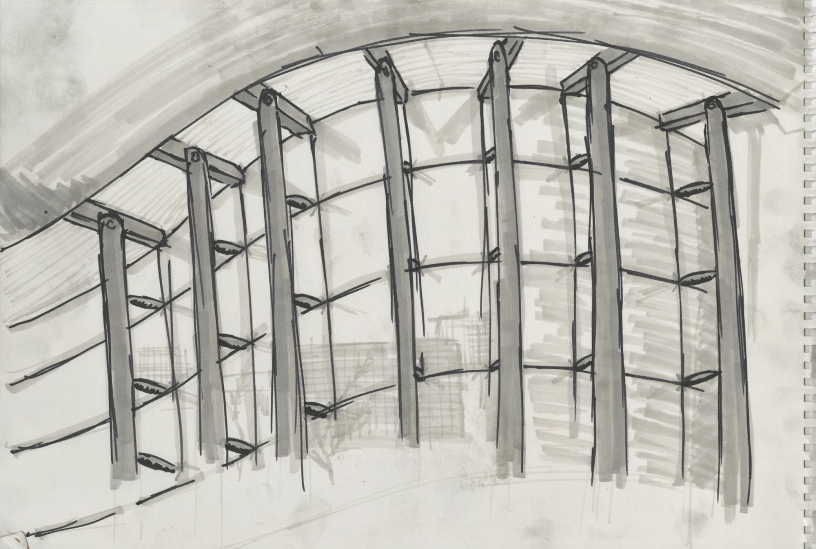
Great use of the negative space the light window has to show some very light and subtle reflections of the cityscape behind has been used in this image, which again focuses on smooth, curved visuals to appeal to the eye. A nice balanced effort has been put into ensuring there is not as much blank space as the last one, and the implied line curving around the bottom of the image is very parallel with the topmost curved line. Some more effort could have gone into making sure the large pylons were better aligned, but they don't detract from the flow of the image.
The third image is a little more unorthodox, in that it doesnt focus on curves and modernism in the same vein as the previous efforts. This one instead has a very intimate, clean feel to it, and the shading is a particular highlight here, notably on the ceiling. The drawing does, however, suffer from a lack of detail in comparison with the other two, particularly the bland right side of the image, which throws off the balance somewhat. Nice subtle shading on the picture frames helps add a third dimension to the image.


No comments:
Post a Comment